

The Blog

The Psychology and Theory of Colors in Marketing, Branding, and Visual Identity
A business guide to color psychology and theory for creating a visual identity, advertising strategies, and marketing campaigns
People often associate color with specific situations, like wearing black to a funeral, decorating with color palettes for special occasions, and bringing red roses to a loved one. Color plays a vital role in people’s ability to express emotion. Colors can communicate how we feel, unite us with others, and even lift our spirits.
Color psychology is a study that uses color theory to understand the different meanings, connotations, and psychological effects colors can have on people.
The study is frequently used in advertising and plays an essential role in conveying a brand’s message. Colors can evoke subconscious emotions that inspire, excite, and soothe. Colors can even raise or lower body temperatures and increase or decrease appetites.
Color psychology is one of the essential evaluations a business should use when marketing, branding, or creating a visual identity.
The History of Color Theory
In 1666, Sir Isaac Newton began experimenting with sunlight and prisms. He discovered that when clear white light passes through a prism, it separates into seven visible colors, each having its own defining wavelength.
Another discovery, through further experimentation, revealed that combining two of the seven colors (red, orange, yellow, green, blue, indigo, and violet) can create additional colors. For example, the combination of red and yellow lights makes orange. Colors born by a combination are called metamers. Interestingly, not every color combination creates a new color. Case in point, when combining yellow and violet, the colors only produce clear white.
By establishing the visible spectrum (the colors we see in a rainbow), Newton laid the path for others to experiment with color scientifically.
Johann Wolfgang von Goethe did not believe colors were simply a measure of light and that some colors came from elements of darkness. He also thought colors are a subjective experience, differing for each viewer. Goethe’s “Theory of Colours” was published in 1810. Goethe’s views on color theory became widely accepted by artists.
Ernst Lehrs wrote about Newton and Goethe’s theories:
“In point of fact, the essential difference between Goethe’s theory of color and the theory which has prevailed in science (despite all modifications) since Newton’s day, lies in this: While the theory of Newton and his successors was based on excluding the color-seeing faculty of the eye, Goethe founded his theory on the eye’s experience of color.”
The Perception of Color
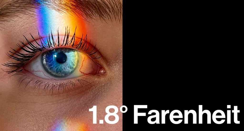
Green is considered one of the most soothing colors, and science is behind it. The wavelength of green light is the most unaffected of all colors and can pass through a cornea, leaving an exact impression on the retina. The color’s appearance, as a result, is evident; this is why most people find the color relaxing and an excellent choice for a business’s visual identity.
Using blue letters with a red background is generally not the most suitable combination for a visual identity. When red light passes through a cornea, it travels slightly beyond the retina’s surface, whereas blue light lands just shy of the retina’s surface. As a result, a logo with a red background will give the displeasing appearance of being elevated above the blue lettering.
An additional physiological effect that colors have on people is through body temperature. If a person stands in a room and the light color changes to red, their body temperature can increase by 1.8 degrees Fahrenheit. If the light color changes to violet, their temperature can drop 1.8 degrees Fahrenheit. Which explains why red, orange, and yellow are warm colors and violet, blue, and green are cool colors.
The Psychology of Color

The concept of color psychology is becoming a significant element in marketing, branding, and visual identity. Researchers have observed color psychology and how colors affect a person’s mood, feelings, and behaviors.
People can have deep associations with colors from past experiences and cultural influences. Western culture views white as purity, and the color is commonly used in marketing and branding to convey a feeling of safety and cleanliness. Many famous brands use a significant amount of white in their visual identity.
However, white represents death, mourning, and unhappiness in Eastern cultures. Knowing the color psychology of Western and Eastern cultures is essential when creating a global marketing campaign. For instance, a bridal campaign may want to use two separate visual identities for Western and Eastern countries.
The Psychological Effect of Color
While the perception of colors is partly subjective, based on personal and cultural experiences, the effects of some colors are universal. Various color shades can have a range of impacts on a person’s mood.
As previously mentioned, warm colors (i.e., red, orange, and yellow) can raise a person’s body temperature. Still, warm colors evoke various feelings, from warmth and comfort to anger and aggression.
Cool colors (i.e., violet, blue, and green) lower body temperatures and can make a person feel calm and peaceful. However, cool colors can cause some individuals to think of sadness and apathy.
Color Psychology of Red
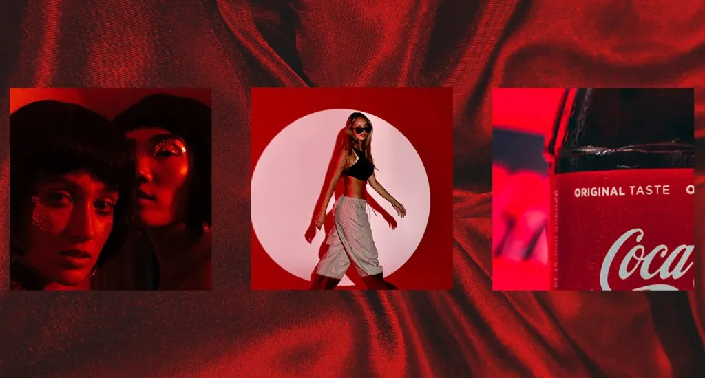
Photo Credit: POLA Studio
Red is a passionate color that increases body temperature, heart rate, and blood pressure. The color can magnify urgency, hunger, and love. The visual identity of red also universally signifies strength and courage.
The psychological effects of red can increase energy and excitement, allowing the color to be used in visual identity to produce motivation and confidence. The use of red should be sparing, as too much can cause optical strain and evoke feelings of pain, defiance, anger, and hostility.
Red is a prevalent color choice for call-to-action buttons, sales logos, and restaurant advertisements to entice customers. Brands that use red in their visual identities include Target, YouTube, Coca-Cola, Netflix, and Superior Grocers.
Color Psychology of Orange

Another warm color, orange, evokes feelings similar to red but is less bold and more playful. It’s a high-enthusiasm color that projects encouragement, optimism, and self-confidence. Some negative associations can be frustration and immaturity.
Consumers tend to associate orange with great value. Businesses that use orange in their visual identity are Home Depot, Amazon, Nickelodeon, and Hooters.
Color Psychology of Yellow

Yellow, a warm color, is illuminating and inspires a positive outlook. It’s a cheerful, uplifting color that promotes creativity and inventiveness. However, if a brand has too much yellow, the result can cause anxiety and apprehension.
Businesses that achieve the right balance of yellow in their visual identity include McDonald’s, Nikon, IKEA, CAT, DHL, and Officially Mrs.
Color Psychology of Violet (Purple)

Violet and purple (i.e., cool colors) can conjure a person’s imagination and spirituality, allowing them to connect with their thoughts. Shades of violet bring forth the feeling of compassion and support and a sense of peace and beauty. Still, some may associate moodiness and excess with violet.
The color is closely associated with royalty and wisdom. Brands that use shades of violet are Hallmark, FedEx, SyFy, and Roku.
Color Psychology of Blue
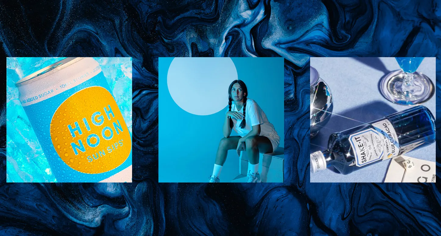
Photo Credit: POLA Studio
Blue is a powerful, cool color, as its different shades evoke different feelings. Light blue kindles gentleness, while dark blue represents strength. All shades of blue are associated with trust, loyalty, and integrity.
The different shades of blue can project the polar opposite effect of the color psychology of red. Blue calms people, reduces blood-pressure rates, and reduces appetites. Darker shades of blue may induce feelings of boredom, uniformity, and rigidity.
Numerous brands use blue in their visual identity, including Facebook, LinkedIn, Twitter, PayPal, The Gap, GM, Ford, Lowe’s, NASA, and GE.
Color Psychology of Green

Green is a calming color, like its fellow cool colors, violet and blue, and it profoundly associates with nature, balance, and harmony. Lighter shades relate to freshness, and darker shades to prestige. Too much green in branding can induce thoughts of greed and envy.
Businesses of all types favor green. Organic and environmentally-friendly companies have success with lighter shades of green, while financial organizations find success with darker shades of green.
Brands that use green in their visual identity are Spotify, Greenpeace, Land Rover, John Deere, Starbucks, Whole Foods, Whatsapp, Hulu, and APenergy.
Color Psychology of Black and White
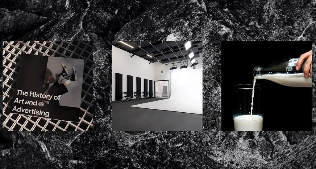
Photo Credit: POLA Studio
As highlighted previously, white symbolizes death in Eastern cultures, while white represents purity in Western cultures. In most people’s minds from Western cultures, white brings forth thoughts of clarity and cleanliness. It is a great choice to create contrast for another color, like black.
In Western cultures, black has long ties to death, which isn’t the worst thing for a casket seller, but it also evokes feelings of sophistication, mystery, and control.
Brands that utilize the sleek characteristics of black and the purity of white to give rise to style include Apple, Gucci, Chanel, Adidas, Nike, Aquatic Arts, Pavilions, and POLA Marketing.
Color Psychology of Pink

Photo Credit: POLA Studio
The color pink is closely associated with femininity, but pink also brings to mind youthful and spunky feelings. Brands that capture these sentiments are Barbie, Claire’s, and Hello Kitty.
Pink is a particular color and is not the best choice for brands looking to reach multiple demographics. However, some brands have found the right balance for their visual identities, including Taco Bell, Dunkin’, and Baskin Robbins.
Color Psychology of Turquoise
Turquoise evokes many positive feelings associated with blue and green. It also brings clarity and recharges one’s spirit and energy levels. To some, this transformative color can negatively induce indecisive feelings.
Brands that successfully implement turquoise into their visual identities are Tiffany & Co., Pampers, and TikTok.
Color Psychology of Gray

Studies have yet to indicate any dominant psychological emotions associated with gray. Still, gray is a sign of intelligence. Brands that use gray include Forbes, Mercedes-Benz, and Wii.
Color Psychology of Brown

The hues of brown are red, yellow, and black. The color projects seriousness like black but with warmth from its elements of red and yellow. Many feel earthiness and reliability when they see brown, while others think of dirtiness and heaviness.
Brown is a crucial part of the visual identity of some prominent brands, including UPS, M&M’s, Hershey’s, Ugg, and Brown University.
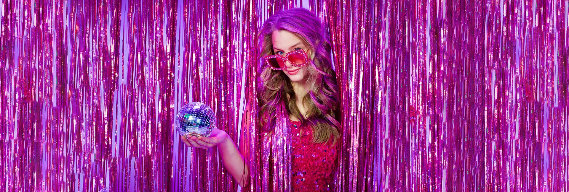
The Most Impactful Branding Trends of 2022 and What Will Continue into 2023
Discover The Hottest 2022 Trends In Brand Identity And Visual Identity, Including Nostalgic And Humanized Branding And How They Are Likely To Evolve In 2023
As 2022 comes to an end and we look toward 2023. It’s an excellent time to take a look at what was popular last year and emerging trends in the world of branding. Over the past year, the branding world has continued to evolve rapidly with new techniques that will likely shape the marketing landscape in 2023.
When it comes to a company’s branding, there are many things to consider, which can be challenging but rewarding. The most difficult part of branding is adapting an established brand identity and visual identity to the constantly changing times.
Regardless of a company’s success, new branding trends and strategies can always prove advantageous and beneficial. However, what was once considered old can sometimes cycle to new in branding. Going into 2023, there are many branding techniques worth exploring.
Nostalgic Branding

Photo Credit: @Vacationinc Instagram Account
The best branding of the future could be a blast from the past. Nostalgia is the sentimental feeling of personal affection toward something in the past that a person has experienced. It brings people comforting memories of where they came from and their experiences. Whether it be someone’s favorite childhood meal, a go-to TV show as a kid, or even certain smells — nostalgia is a powerful stimulant.
Nostalgic branding is a great way to gain attention from older audiences as they have more memories than younger crowds. Companies can invoke nostalgia in their customers to create positive associations between branding and a person’s past. The development of customer relationships and trust can form by creating a subconscious feeling of a positive experience between a specific company and a person.
Implementing Nostalgic Branding
Companies that would like to adopt a nostalgic branding strategy have different ways to approach their brand and visual identities.
Visual Nostalgia
One of the most successful examples of nostalgic branding in 2022 was through visual nostalgia. Many sporting franchises succeeded with their branding by making throwback logos more commonplace.
NBA teams implementing visual nostalgia through throwback jerseys in 2022 include the Phoenix Suns, Miami Heat, and the Detroit Pistons. A few NFL teams that also utilized visual nostalgia are the Miami Dolphins, New Orleans Saints, and New England Patriots. The throwback jerseys had real logos and color schemes used in the past or had retro styling. The majority of these throwbacks came from the 1960s through the 1990s. The strategy was to invoke nostalgia in fans between 30 and 60 years old.
Audio Nostalgia
Another way that companies can incorporate nostalgia into their branding is through audio nostalgia. The highest-grossing film of 2022 was “Top Gun: Maverick.” This film is a sequel to the original, “Top Gun,” released in 1986. The film’s name alone invokes visual nostalgia in everyone who grew up in the 1980s and loved the film. However, chills ran through viewers’ bodies when hearing the iconic song “Danger Zone” in the movie’s trailer.
Nostalgia audio was a massive reason why over 55 percent of moviegoers for the film were over 35 years old. When looking at the overall box office performances of 2022, “Top Gun: Maverick” beat out all other films and grossed $300 Million more than the next closest film. With its success in 2022, nostalgia will be a popular branding trend going into 2023 and for the foreseeable future.
Humanized Branding

Photo Credit: from Printmag.com
Humanized branding was all the rage in 2022 and is expected to be a hot trend in 2023. It is intended to build customer trust while making a brand stand out. Humanization in a branding context is the process of making a company’s branding have human-like characteristics.
One way this is achieved is by having advertisements rooted in everyday, real-world interactions. Another is by portraying a company’s social media presence as a real person. Creating a mascot is also a great way to show a brand with more human characteristics.
Humanized Branding Personality
It has been shown that consumers tend to trust companies more when they have a humanized personality. Most everyone enjoys hanging around people with great characters, which also applies to companies with great characters.
One way in which a company can further humanize its personality is to make advertisements more playful. Humorous advertising and branding can make a company seem more lifelike to many consumers, increasing customer loyalty and trust. The strategy makes a company more approachable, which can be helpful in many situations.
Another way to incorporate personality into a company is to have a strong brand mascot. Some of the most well-known company mascots worldwide are Mickey Mouse, Tony the Tiger, and the Kool-Aid Man. They help with brand recall and recognition and also help to humanize the company from a consumer perspective.
Humanized Social Media
A humanized social media account is a great way to further companies’ brands and gain consumer trust. One of the best examples of humanized social media is Netflix’s Twitter account. Netflix uses this platform in a very humanized manner. It retweets popular posts on Twitter as an average person would. It also posts humorous content, such as memes and GIFs, which is extremely popular with people of all ages. These relatable and humanlike social media posts cause people to feel a connection with Netflix subconsciously, which in turn builds trust.
Humanization of social media accounts could be the next big step for many companies’ branding in 2023. Based on its success in 2022 from top brands like Netflix, the humanization of social media should be here to stay.
A Bright Future for Branding
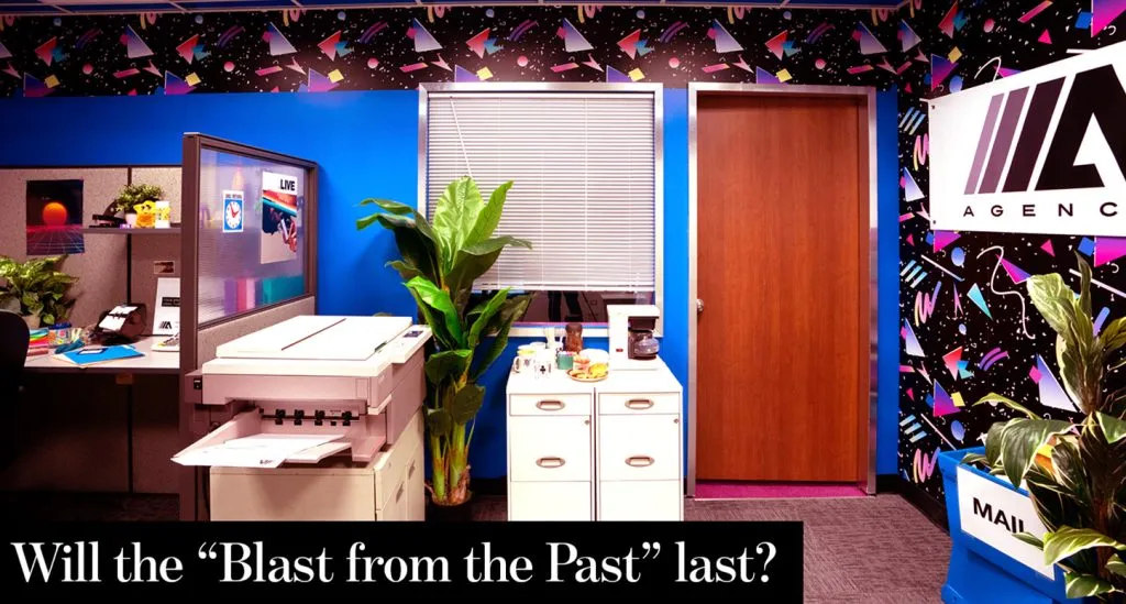
Photo Credit: from Katiemerrilees.com
With 2023 knocking on the door, companies are excited about their branding ideas for the future. The nostalgic and humanized branding trends from 2022 will most likely become a staple of the branding game in 2023.
There will always be innovative and unique concepts to experiment with in branding, and while strategies are essential, finding the proper branding technique for each company is equally as important.

The Creative History of Marketing from Advertising Art to Graphic Design
How the history of visual communication and advertising art paved the way for the graphic design practices that make up today’s creative marketing campaigns
Whether painting symbols on stones or creating digital ads, people have always found a way to convey their message to others visually. Over the years, advertising artists and graphic designers have shaped how businesses speak with consumers. Visual communication’s ever-evolving nature has solidified its importance in creative marketing today. Without visual art, creative marketing would be incredibly challenging and may not exist.
The Purpose of Art in Advertising and Marketing
Advertising artists and graphic designers use color, text, and images to communicate and visually evoke certain emotions from viewers. Graphics grab attention, colors incite feelings, and the text provides valuable information. Using artwork in advertising streamlines different modes of communication into one graphic that fits into the fast-paced marketing world.
The Difference Between Advertising Art and Graphic Design
Advertising art, or advertising design, and graphic design overlap in many ways, but key factors make each specialization vastly different. Advertising art is a segment of graphic design. All advertising artists are graphic designers, but not all graphic designers specialize in advertising art.
Graphic design goes deeper than surface level. The scope of work involved in graphic design includes typography, branding, logo development, and visual identity. While graphic design focuses on developing a brand identity, advertising art focuses on using it to create visually appealing artwork that produces sales.
Throughout history, advertising artists and graphic designers worked together to create some of the most famous ad campaigns. However, these roles have evolved. Presently, most graphic designers take on the work of advertising artists, combining the two roles into one.
The Earliest Accounts of Advertising

For as long as humans have been communicating, advertising has existed. Historians often trace advertising back to the Paleolithic era, when paper and pencil did not exist. Painting or carving symbols and images on stone helped prehistoric people communicate with other tribes. These drawings helped to notify people of the time of significant events and news updates.
Advertising methods changed as the world evolved and people invented new technology. In ancient Egypt, people began to use papyrus to create posters for events or celebrations. In the 1400s, technology changed drastically with Johannes Gutenberg’s invention of the printing press.
Although machines could now print posters, signage, and pamphlets, artists still had to draw or paint pictures, or advertising art, by hand. At the time, hand-drawn pictures had to be transferred to wood engravings on printing blocks for printing presses. Shakespeare partook in advertising art for his plays by hanging posters, or bills, on posts back in the Elizabethan era.
From the Paleolithic era to the Elizabethan era, the modes of advertising changed considerably. Still, the 1900s bore more evolution to advertising artwork than one could imagine.
The Modern Evolution of Advertising Art
By the 1900s, companies, publications, and politicians began producing advertising art for the masses. Printing presses became faster and more detailed to fit the needs of communicating with growing populations. Throughout the 20th century, the expansion of advertising art quickened and jumpstarted what is now known as creative marketing.
The 1900s to the 1920s

Photo Credit: RBKC Library
By 1900, printed media in color had become more common. With the popularization of magazines in the late 18th century, companies began to see promise in using publications to promote their products.
Jell-O, the famous food company, leaped by producing a free recipe book in 1904. The book’s cover artwork features kewpies helping a young girl cook with the product. The cover also stated the product’s price, 10 cents per package, in text. Most brands didn’t partake in extensive advertising or marketing campaigns then — this campaign was monumental.
In 1919, Derry and Toms, a drapery business, hired F Gregory Brown to create a colorful stamp collection. Each stamp featured colorful illustrations of clothing, jewelry, or housewares. Finding the most niche artist to create advertising content became a trend that continued throughout the 1900s.
The 1930s to the 1950s

Photo Credit: Lifesavers (1943). All American Ads 90s (348).
In the mid-1900s, advertising campaigns became more advanced than ever before. Magazines remained a primary mode of business advertisement and proliferated in the 1950s. Still, companies only invested in one or two large advertising projects each year. These elongated timelines gave them the budget to put great thought into each campaign.
Shell-Mex, a petroleum company, employed several visual artists for its campaigns throughout the 1930s. One of the most iconic advertising artists and graphic designers of the time, Edward McKnight Kauffer, designed an abstract poster for the company in 1935.
In 1948, Life Savers published an ad in Life Magazine that set the standard for creative advertising. The ad placement in a magazine with a similar namesake hit home for readers. The creative included an illustration of a stoplight with Life Savers candies in place of the red, yellow, and green lights. The copy brought it all together by stating, “Stop — for a delicious treat. Caution — accept only the candy with the hole. Go — pick up a handy package. Still only five cents.”
The creative advertising of the 1930s, 1940s, and 1950s influenced the boom of advertising and marketing to come in the 1960s. A new era of individuality and countercultural movements was on the horizon.
The 1960s to the 1980s
The late 1900s were full of new music, traditions, and fashions. All of which influenced magazines, posters, and advertisements. In this era, poster-making, animation, and pop art took over in ads. By the 1960s, television replaced radio as the world’s leading digital information source. Artists used funky fonts, contrasting colors, and psychedelic themes to create graphics and animations to attract their desired audiences. The artwork of the time reflected the culture, and the advertising reflected all of the above.
The counterculture of the 1960s brought wild graphics and originality into the advertising spotlight. Canadian artist, Bob Masse, created some of the most iconic rock music posters in the 1960s. Music artists like Pink Floyd, Grateful Dead, Fleetwood Mac, and Janis Joplin hired him to create eye-catching posters to advertise their events.
In the late 1970s, the famous denim brand Levi’s tapped into the psychedelia of the times to create memorable advertising. The brand released a series of animated television ads centered around themes of existentialism and individuality. The commercials included animations of people or odd characters wearing multicolored Levi’s pants. The psychedelia-inspired graphics and ad campaigns of the 1960s and 1970s walked so 1980s contemporary graphic design could run.
By the 1980s, artists and advertisers stealthily moved away from flowy fonts and earthy colors. Sharp lines, bold fonts, and neon color blocking better reflected the technological innovations of the time. Futuristic elements, space themes, and celebrity endorsements overtook magazine, newspaper, direct mail, and television advertisements.
Coors Light, a prominent beer company, found prominence by licensing movie characters to create some of the most effective advertising campaigns of the 1980s. One ad featured E.T., the main character of Universal Pictures’ number-one box office movie in 1982. In the ad, E.T. is pictured as a bartender telling the viewer, “If you go beyond your limit, please don’t drive. Phone Home.”
Another campaign that earned Coors Light immense recognition was the Halloween-themed ad set featuring Elvira from the horror movie Elvira, Mistress of the Dark. In one ad, Elvira is stirring a cauldron of Coors Light. The text reads, “My favorite brews!” Elvira was featured in several other campaign ads, resulting in Coors Light becoming known as the beer of Halloween.
Some claim that the 1960s, 1970s, and 1980s were the golden age of advertising. Each decade stands out in design trends, advertising methods, and social and political ideals. The most diverse eras of advertising assisted in pushing marketing and advertising boundaries even further throughout the 1990s.
The 1990s to the 2010s
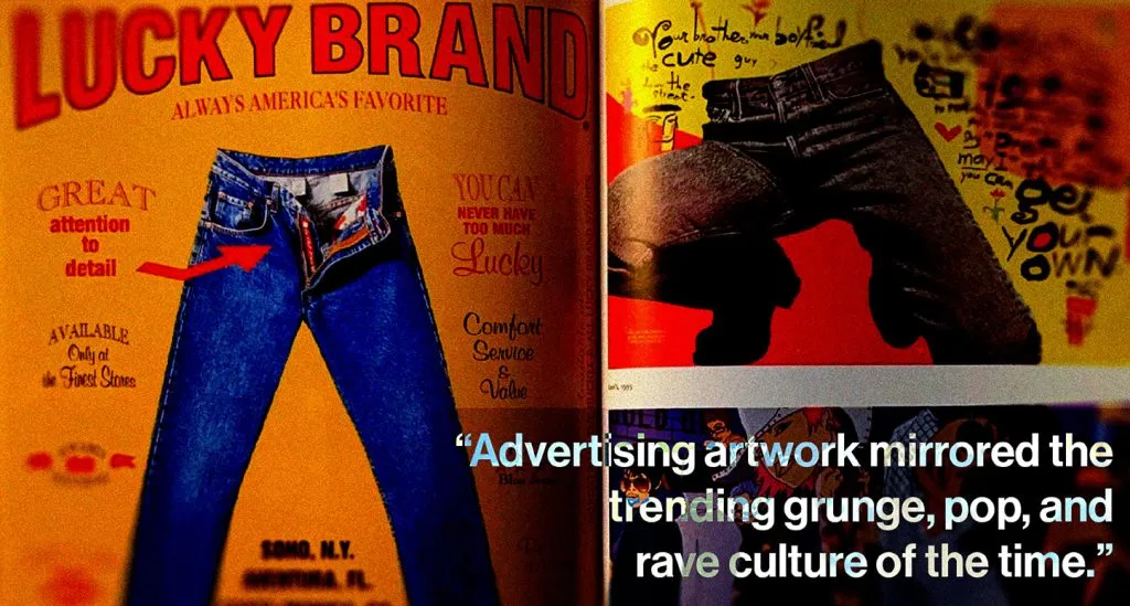
Photo Credit: Lucky Brand (1998). Levis (1995 and 1998). All American Ads 90s (476-477).
At the turn of the decade, the most significant advancement in technology since the invention of the printing press came about. The IBM Personal Computer gave millions of people internet access without leaving home. This invention completely changed the way artists and illustrators worked. Thus altering the way companies utilized advertising art and graphic design moving forward.
By the 1990s, many artists were implementing drawing software and learning to use digital tools for their advertising art. Digital graphic designers had to quickly learn how to utilize the new software for their jobs, ensure all art was print-ready, and spend more time in production. As a result, companies began hiring in-house graphic designers versus outsourcing commissioned artwork from visual artists.
Advertising artwork mirrored the trending grunge, pop, and rave culture of the time. Ads favored dark, pastel, and neon color palettes, with thin sketch-like typography and funky designs. Photoshop was becoming increasingly popular thanks to the popularization of celebrity endorsements.
In 1996, the National Fluid Milk Processor Promotion Board affixed the “Got Milk?” campaign into American culture. The campaign featured celebrities like Ivana Trump, Jennifer Aniston, Whoopi Goldberg, and David Beckham with milk mustaches. The company then published the campaign ads in magazines, newspapers, and online.
At the turn of the century, illustration technology reached new heights. Advertising artists had access to advanced digital production. Video game technology and computer-generated imagery (CGI) seeped into the world of graphic design. This newer technology leveled up all advertising efforts and led to the artwork we see in marketing campaigns currently.
How Vintage Advertising Art Lives on Through Modern Graphic Design
Elements of the 1960s, 1970s, 1980s, and 1990s remain primary inspirations for graphic designers. Many graphics are a combination of characteristics from each era. Looking closely, one can see the impact advertising art from past decades has had on current designs.
Many companies have launched campaigns reminiscent of design trends from past eras. Budweiser reimagined one of its advertising campaigns from the 1950s and 1960s. The new ad utilizes the advertising art style from the original, but Budweiser updated the message to fit the current social standards.
The Importance of Graphic Design in Marketing Now
When it comes to marketing and advertising, graphic design is the foundation. Businesses, artists, writers, government entities, and public figures need graphic designers to assist them in communicating visually. One can even find graphic design elements in aspects of everyday life.
Posting visual content on social media has become a primary form of communication for businesses. Most marketing firms and agencies recognize this and have built their own graphic design departments to keep up with the demand for visual content. Creative directors and graphic designers now control a brand’s visual identity, which grabs viewers’ attention before any other marketing tactic occurs.
From its conception in the Paleolithic era, visual communication has become an all-encompassing element of marketing and design. Advertising art and graphic design have sparked interest, created visual appeal, and given artists the spotlight in marketing. There is no guessing where graphic design will go from here. Today’s technological advancements, especially in Artificial Intelligence (AI), hold much promise.

How Liquid Death Mountain Water Killed Traditional Marketing
Why liquid death’s rejection of traditional marketing and illustrious branding sets the canned water brand apart from other beverage companies
Since Liquid Death stepped on the scene in 2018, the marketing world has been perplexed by the success of the brand’s touchy yet effective promotion strategies. Liquid Death sells canned mountain water by loathing marketing, thirst, and plastic. The brand’s $700 million net worth proves there’s gold in guerilla marketing and misrule. No wonder everyone and their mother are talking about Liquid Death.
The Birth of Liquid Death

Photo Credit: XR Studios Hollywood Campus
Everything about Liquid Death goes against the status quo, from conception to branding. Even the melting skull logo adorning the product’s signature king cans, also known as tallboys, proves individuality.
The founder is no stranger to alternative ways of marketing. Growing up in the hardcore and heavy metal scene of Philadelphia, Mike Cessario spent many years playing in bands and attending Warped Tour with fellow delinquents. One could say this was where Cessario’s rebellious creativity first emerged.
Cessario somehow found a path in corporate advertising which helped him gain footing for the birth of Liquid Death. It turns out that years of pitching creative ideas to boring business people can produce anarchist marketers. While attending Warped Tour in 2009, he recognized that plastic water bottle companies lacked the eccentric branding that various beers and energy drinks had in the same setting.
“Liquid Death was essentially the perfect combo of my passion for alternative culture, music, art, comedy, and health, along with my passion and experience for pushing the boundaries of marketing and advertising to make it suck less,” said Cessario.
It is easy to believe that Liquid Death’s success falls on the founder’s shoulders, but ongoing partnerships, social content, creative campaigns, and the company’s mission feed into the unconventional success of Liquid Death.
The #DeathToPlastic Manifesto

Liquid Death’s central mission is to end plastic pollution. To get the message across, the brand shames plastic water bottle usage and champions the consumption of its product — water in a recyclable aluminum can. Liquid Death dedicates an entire webpage to this campaign, where environmental facts and comically dark commercials live to enhance the power of Liquid Death’s mission.
“Plastic is not technically recyclable anymore because it is no longer profitable to recycle,” says the webpage. “But of all the aluminum produced since 1888, over 75 percent of it is still in current use. #DeathToPlastic.”
Instead of simply calling out plastic consumption, Liquid Death provides a solid solution to eradicate it. Every time the brand mentions #DeathToPlastic, it also states the perks of canned water.
The brand’s #DeathToPlastic is the primary driving factor behind each campaign launch. The character and voice Liquid Death uses to communicate its mission, combined with repetitive consistency, creates a powerful magnet that attracts key audiences most likely to commit to the brand eternally.
An Alternative Pairing: Liquid Death and its Punk Target Audience
Liquid Death uses its metalcore and punk audience to nail its branding. The best part is that the audience is complacent. There’s only one logical explanation for why this strategy works: the relationship is mutually beneficial. The audience can support a company with sick, oddball branding that aligns with its core values. Liquid Death gets a devoted crowd to model their brand voice after.
In an interview with Pittsburg Music Magazine, Cessario said, “People would be surprised that there’s a huge portion of the alternative, punk, and metal culture that actually cares about health and the environment, and that tends to be who instantly connects with our brand mission and humor.”
If rejecting corporate marketing, murdering thirst, and ending plastic pollution sounds attractive, welcome to Liquid Death’s target audience. Punk or not, the defiant audiences Liquid Death attracts complement the brand’s mission and marketing outlook in ways that open new doors and extend its success.
How Liquid Death Rocked Bonnaroo Music and Arts Festival
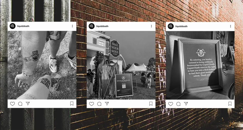
Collecting human souls at a music festival in rural Tennessee isn’t a marketing tactic that most brands adopt. For the canned water company Liquid Death, there is no brand activation more fitting.
Liquid Death started partnering with music festivals shortly after its conception in 2018 and continues to utilize the market for brand activations and partnerships. In 2021, Live Nation, the world’s leading entertainment company, partnered with Liquid Death to regularly bring canned mountain water to concertgoers.
In June 2023, Liquid Death built an on-brand country club at the innermost point of the Bonnaroo Music and Arts Festival. A hot, sunny event built on community and positivity sounds like the last place one would find Liquid Death. Ironically, many rock bands like Knocked Loose, Korn, and Alex G, to name a few, appeared on the lineup this year. A brand partnership with Bonnaroo was the perfect opportunity for Liquid Death to connect with loyal customers while drawing the attention of ordinary folk.
Alongside the Liquid Death mansion, a sign read, “Sell your soul. Join the club,” a surefire way to attract lovers of the unconventional. Two golden grim reapers greeted guests who dared to feed their curiosity as an usher urged them to fill out a contract signing their souls to Liquid Death to enter.
The sell-your-soul contract reeked of Liquid Death. In line with its hate-for marketing tactics, the brand gathered customer information in the most extreme and ironic way possible. The contract was titled “Bill of sale for one eternal human soul” and promised the seller free membership into the Liquid Death country club in exchange for their soul. The deadly messaging is reminiscent of anything but corporate marketing.
Once participants signed the contract and continued their journey through the activation, Liquid Death bombarded them with sly brand recognition tactics. Visitors walked into a gallery of artwork and paraphernalia related to Liquid Death’s past and current marketing campaigns — a subtle way to reinforce the brand without abiding by traditional marketing standards.
The newly soulless could get a free airbrush tattoo while roaming the air-conditioned mansion with a free can of Liquid Death in hand. That’s right Liquid Death turned attendees into walking billboards. Inside the building, a makeshift tattoo parlor enticed participants to get one of four Liquid Death logo variations airbrushed on their bodies. They then could sport the tattoos around the festival grounds throughout the weekend. Another subtle reminder that Liquid Death does marketing differently.
Rejecting Tradition and Reaping Success
Liquid Death makes guerrilla marketing look too easy. The brand’s rebellious nature and intense mission to aid the environment are hard for many to resist in a world swarming in search of the next sale. Consumers have become tired of traditional ads and promotions. Liquid Death counters that by bringing humanity, edge, and honesty into the equation. There are many reasons why Liquid Death’s marketing scheme works, but at the end of the day, the company proves successful by rejecting the norm and selling its persona, not its product.

How Brands Became Worthy of Wearing, Thanks to the T-shirt
The history of graphic tees and how brands like coca-cola and nasa capitalize on their influence to increase brand recognition among fans and consumers
At the intersection of marketing and fashion lies the graphic T-shirt — an avenue for people to become walking billboards for their favorite popular brands. From celebrity influence to direct-to-consumer (DTC) marketing strategy, the graphic tee offers much for companies with established branding.
The evolution of the tee unveils its transformation from a humble, plain undershirt to a vibrant and expressive garment that now appears in wardrobes worldwide.
From Plain Undershirts to Rebellious Graphic Tees
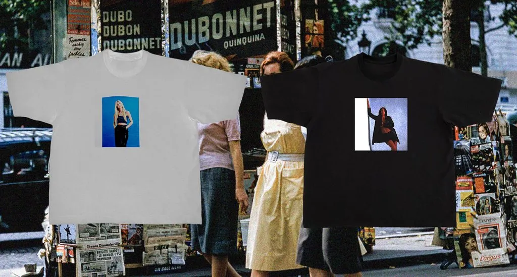
Photo Credit: POLA Studio
Although brief, the history of the tee plays a significant role in understanding why so many brands use them to market to consumers today. What used to be a drab white undershirt is now a colorful and expressive garment universal to wardrobes around the globe.
The first appearance of tees in American history dates back to the 1800s when factory workers cut the pants and sleeves off their jumpsuits. What started as a way to stay cool in summer became an iconic clothing trend. In 1913 the U.S. Navy designated the clothing item as the official undergarment for its soldiers. P.H. Hanes Knitting Company, now known as Hanes, and other companies like Fruit of the Loom started mass-producing undershirts.
The first documented appearance of a graphic tee was in “The Wizard of Oz” in 1939, when actors sported green tees with Oz written across the front. Despite their brief appearance, graphic tees were not widespread until the late 1940s. Wearing plain white tees as anything other than undershirts was still taboo. This perspective changed when acclaimed actors Marlon Brando and James Dean appeared on-screen wearing basic white tees. The exposure from the cult movies “A Streetcar Named Desire” and “Rebel Without a Cause” signaled to the general public that wearing standalone undershirts was now acceptable and even cool.
Many people started to notice the tee’s rise in popularity as an opportunity. In 1948, Thomas Dewey created a graphic tee with text that read, “Dew it with Dewey,” to promote his U.S. presidential campaign. The now-defunct company Tropix Togs obtained a license to print Disney’s Mickey Mouse on tees kickstarting the trend of putting iconic logos on tees. These campaigns popularized the graphic tee as a fashion trend and a marketing tactic in one fell swoop.
As the 1970s approached, people moved away from the mainstream and started associating the graphic tee with rebellion. With the invention of screen printing, designing customized tees became more accessible, creating a medium for the time’s political, social, and cultural messages. Painters and airbrush artists capitalized on this and began using tees as a canvas for artwork and powerful statements. As Americans leveraged the tee as a radical tool, its power became more apparent.
In the 1990s, graphic tees became a marketing tool for clothing designers, food and drink companies, television shows, and any company wanting to get their brand on the public. With a graphic tee, brands and companies can build brand awareness or evoke nostalgia in the masses.
How Pop Culture Popularized the Iconic Graphic Tee
Some of today’s most iconic graphic tees are infamous because of movie features, celebrity influence, or simply good music. Many brands like Nike, Addidas, Levi’s, and Calvin Klein can attribute their incomparable brand recognition to clothing like tees. Coca-Cola, NASA, and Harley Davidson logos appear on graphic tees sold at Walmart, Target, and other stores worldwide. The power of tees would be null without the contribution of pop culture.
Famous Tees from Movie Features

Photo Credit: POLA Studio
The film industry has and continues to influence American pop culture, especially its fashion. Similarly to the characters who made the plain white tee a hot commodity in the 1950s, modern-day film and television characters have inspired fashion’s most iconic graphic tees through the ages.
The grey Mumford Physical Education tee became popular in the 1980s after Eddie Murphy’s character Alex Foley wore it in “Beverly Hills Cop.” In 2004, after the release of the movie “Napoleon Dynamite,” the graphic ringer tee with “Vote for Pedro” printed on the front rose to fame.
Celebrity Influence on Graphic Tees
Over the decades, celebrities have convinced millions to rock various graphic tees simply by wearing them out in public. After a breakup with Justin Timberlake in 2004, Brittney Spears modeled a baby blue tee with the phrase “dump him” printed in orange on the front. T-shirt companies still produce replicas of this design today.
When making a political statement, graphic tees are the go-to, especially for celebrities who paparazzi constantly photograph. In 2017 Dior released a tee with the phrase “We should all be feminists” printed on the front. Many stars like Karlie Kloss, A$AP Rocky, and Winona Ryder wore it to support the feminist movement. A percentage of the proceeds from the release went to Rihanna’s non-profit organization, the Clara Lionel Foundation.
The Iconic Graphic Tee
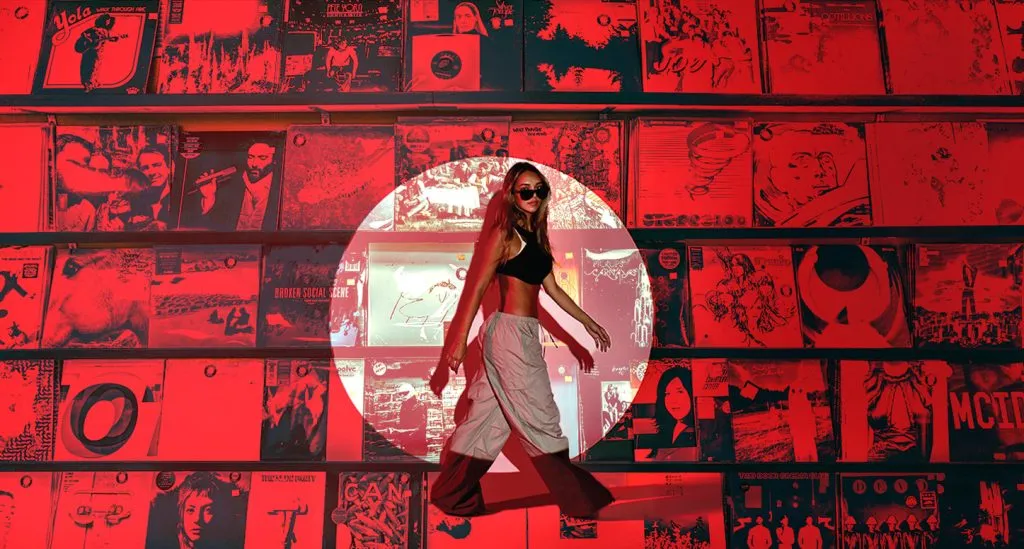
Photo Credit: POLA Studio
The 1970s made graphic band tees an everlasting staple in American fashion. Once bands realized that their fans enjoyed sporting their band logo on tees, it became common practice in the industry.
People recognize many bands by their logos just as much as their music. Some of the most undying graphic tees sport the following bands’ logos or album covers:
● The Rolling Stones
● The Beatles
● Pink Floyd
● Nirvana
● Led Zeppelin
● Grateful Dead
● Wu-Tang Clan
Big Brands Dominating the Graphic Tee Trend
Many often forget that big brands contribute to pop culture, as well. Few brands consistently dominate the graphic tee trend through the decades, like Coca-Cola, Harley Davidson, and NASA.
Coca Cola
In the 1980s, in partnership with Tommy Hilfiger, Coca-Cola launched a rugby shirt with its logo. Many coveted the shirt, kicking off Coca-Cola’s persistent presence in the graphic tee world. The company’s many brands have become a go-to for companies who mass produce graphic tees. Coca-Cola has successfully cemented Coke, Sprite, and Fanta in American fashion.
Harley Davidson
Harley Davidson’s rise to fame in the graphic tee industry started in the 1950s. The company prioritized functionality and ease of wear when it launched leather jackets for both men and women. Alongside the rise of the popularity of tees in the 1970s, Harley Davidson released branded tees. By 1992, the brand found its way into the mass market, producing more designs and styles of tees for the public.
NASA
NASA is another quintessential brand whose logo appeared on graphic tees everywhere seemingly overnight. What first made the brand logo a popular feature on clothing wasn’t the graphic tee but its collaboration with the designer handbag company Coach. After launching the collection in 2017, thousands of brands saw the logo’s potential. Plus, unlike other notorious brand logos, NASA can’t license its logo because it is a government agency making it accessible for public use. NASA graphic tees appear in numerous online clothing stores and local and national chain clothing and department stores.
Graphic Tee Marketing is the Ultimate Hack for Any Brand
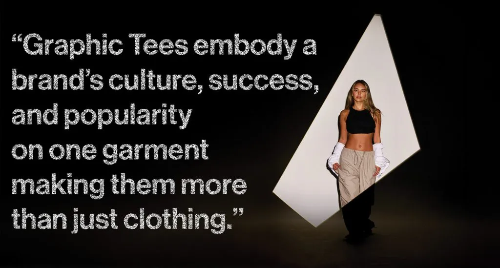
Photo Credit: POLA Studio
Most fans would happily rock a graphic tee featuring a brand or band logo they enjoy. What makes Coca-Cola, Nirvana, and Nike graphic tees so impressive is their ability to influence the general public, not just fans, to wear their logos. Graphic tees embody a brand’s culture, success, and popularity on one garment, making them more than just clothing. These brands’ logos have gained them a high status in American fashion trends.
Given the graphic tee’s power, it is no surprise that many DTC companies look to produce branded clothing to increase awareness and recognition of their products. The trend has become a popular marketing strategy with great success. Although not on the same level as Coca-Cola in popularity, Wonder Valley, Fishwife, and Chamberlain Coffee are well on their way to achieving streetwear status. Their distinctive logos embroidered or screen printed on high-quality tees are irresistible to even the most casual of fans.

What Visual Identity is and Why it’s Important for Building a Strong Strategic Brand
Photo Credit: Pinterest
A complete business guide about the essential aspects of branding, known as visual identity
People have expressed themselves with visual identity throughout the history of humankind, from America’s petroglyphs and Egypt’s hieroglyphs to Scotland’s Pictish Stones and Ireland’s Celtic symbols.
Renaissance paintings and book designs were the first visuals to transcend cultural boundaries, reaching mainstream popularity and inspiring generations. Styles of modern visual identity include Art Nouveau, Bauhaus, Art Deco, Swiss Design, Pop Art, and Postmodernism.
The launch of Photoshop in 1990, a new design platform, gave birth to the digital age of visual identity. From stones and canvases to computers and iPhones, our society has witnessed many advances in how visual identity is displayed. However, despite the plethora of design programs available, the goal of visual identity remains the same — creating authentically distinct graphics with a magnetic presence.
Social media channels are the prevailing mediums today and offer significant exposure for the promotion of brands. Creating captivating designs that personify the visual identity of a business is a crucial element in any campaign strategy, especially for social media strategies.
Anyone with a computer and a social media account can design a new logo, blast organic posts, and utilize Meta ads, which is why social media runs full of prosaic content. Taking the time to meticulously develop a business’s visual identity is the only way to stand out from the copious daily content.
What Visual Identity Entails
Visual identity is a composite of compelling and distinguishing elements representing a brand. The main elements in a brand’s visual identity are its logo, colors, and typography. The elements must meld into cohesion while displaying unique aesthetics to cultivate brand awareness.
The purpose of establishing a visual identity is not solely to attract customers’ and clients’ attention. That’s not enough. The imagery must convey core values to generate and convert leads.
Once a visual identity perfectly embodies a company’s brand — exercising patience is a requirement. The new graphic will likely not convert leads immediately. Still, as exposure increases and target audiences become more accustomed to the visual identity of a brand — associations will form through visual cues. Lead generation and, ultimately, conversions will follow.
What to Consider When Designing a Visual Identity
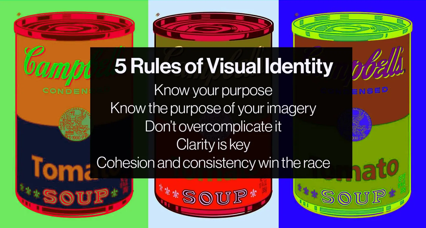
Photo Credit: Flickr.com
Before creating a visual identity, designers must consider a business’s target audience and the emotions the imagery should stimulate. The design needs to be all-encompassing and applicable to various campaign strategies. It also must not resemble a competitor’s logo in order to stand out in the audience’s minds.
The clarity in a design is paramount. Some designers make a grave mistake by overcomplicating a design, leading to confusion about a brand’s visual identity. More simplistic designs that represent a brand perform better in well-targeted campaigns. They are easier to reproduce and use in different mediums, including interior and exterior spaces, digital, and print.
The foundation of a design must also endure. Visual identities that last, do so because they do not follow fads. At the same time, a design’s foundation needs to be versatile and evolve with its brand to stay relevant in the marketplace.
Great visual identities are like flower beds. If appropriately nourished, they will grow and attract attention. However, if they are not adequately maintained, growth will be sporadic and could eventually die out completely.
A business’s brand identity (e.g., message and persona) and visual identity need cohesion for sustainability and growth. The brand’s voice needs to be reflected in the logos, colors, and typography to avoid a business from appearing disjointed.
Separated, brand identity and visual identity will never be complete. The two must support each other to truly shape a business’s identity.
Types of Visual Identity
A logo is the most critical element in visual identity. It is the first impression of a business in the eyes of customers or clients. The design of the logo, its colors, and typography — all factor into a business’s ability to convert leads.
There are nine main types of logos: pictorial mark, abstract mark, emblem logo, letterform, lettermark (monogram), mascot logo, wordmark, combination mark, and dynamic logo.
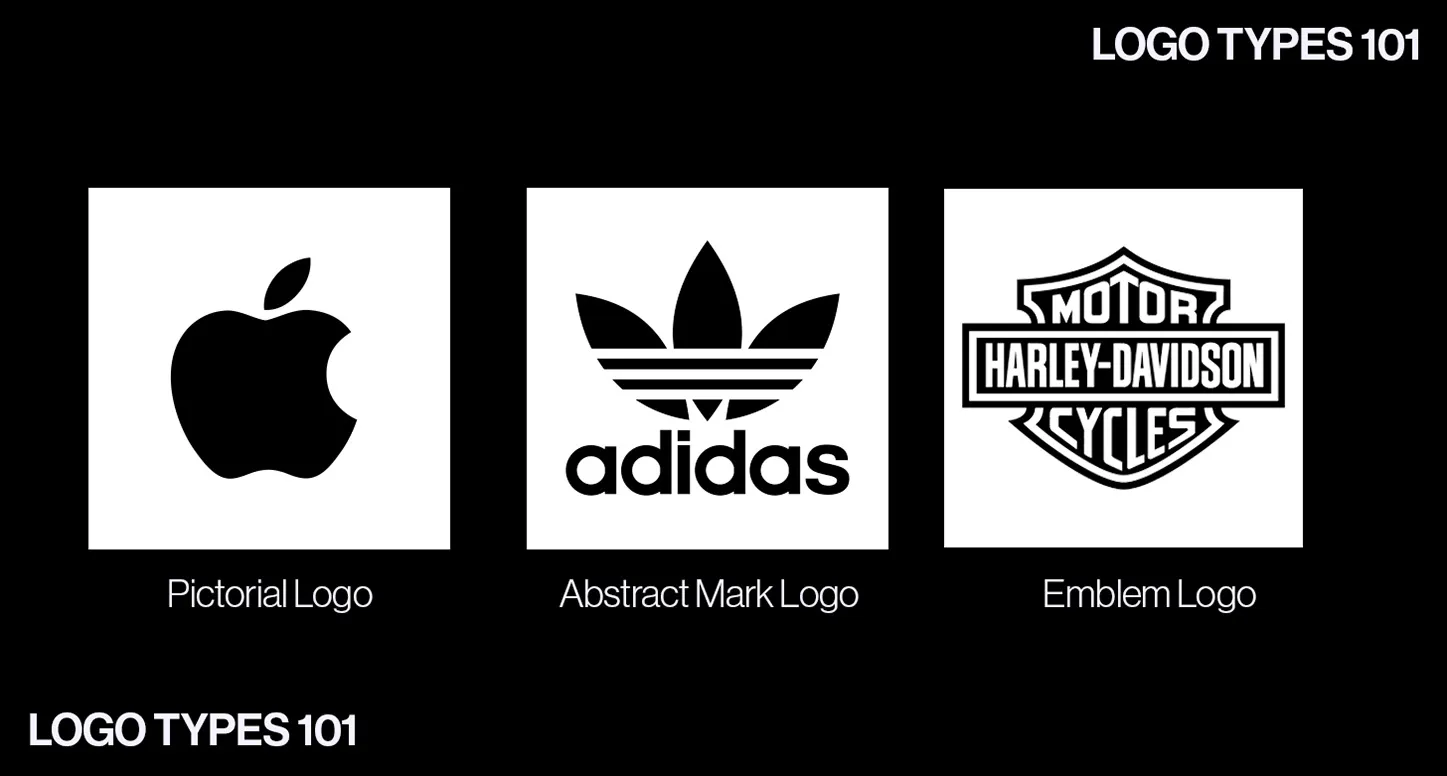
Pictorial Mark
A pictorial mark, also known as a brand mark or logo symbol, is a graphic icon that simplistically yet faithfully depicts an image. Apple’s iconic apple logo is the epitome of a pictorial mark. Other icons are TikTok’s music note and Target’s bullseye.
Abstract Mark
Some believe abstract marks fall under the category of pictorial marks, but where the two dramatically differ is in the design style. Pictorial is more straightforward, like Apple’s iconic logo, whereas abstract is impressionistic. Abstract logos include Adidas’s flower, Nike’s swoosh, and Pepsi’s divided circle.
Emblem Logo
An emblem logo is similar to a seal or a family crest. Their designs are usually traditional yet polarizing. Examples include the Federal Bureau of Investigation, Harvard University, Harley-Davidson, National Football League, and Starbucks.
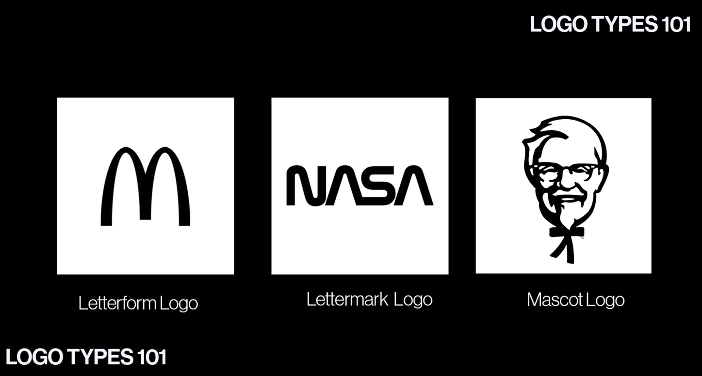
Letterform
A letterform is a logo in which a single letter represents the brand. The letter is most commonly the initial of a business’s name. Prominent letterform depictions include Facebook, McDonald’s, and Netflix.
Lettermark (Monogram)
Lettermarks, also known as monogram logos, are acronym designs. Lettermarks usually consist of three to four letters. Famous examples include IBM, NASA, and HBO.
Mascot Logo
Mascot logos are relatively self-explanatory. The logo features a spokesperson representing the brand, sometimes a cartoon character. Notable examples include the Kool-Aid Man by Kool-Aid, Tony the Tiger by Kellogg’s Frosted Flakes, The Chicago Bulls, and Colonel Sanders by KFC.
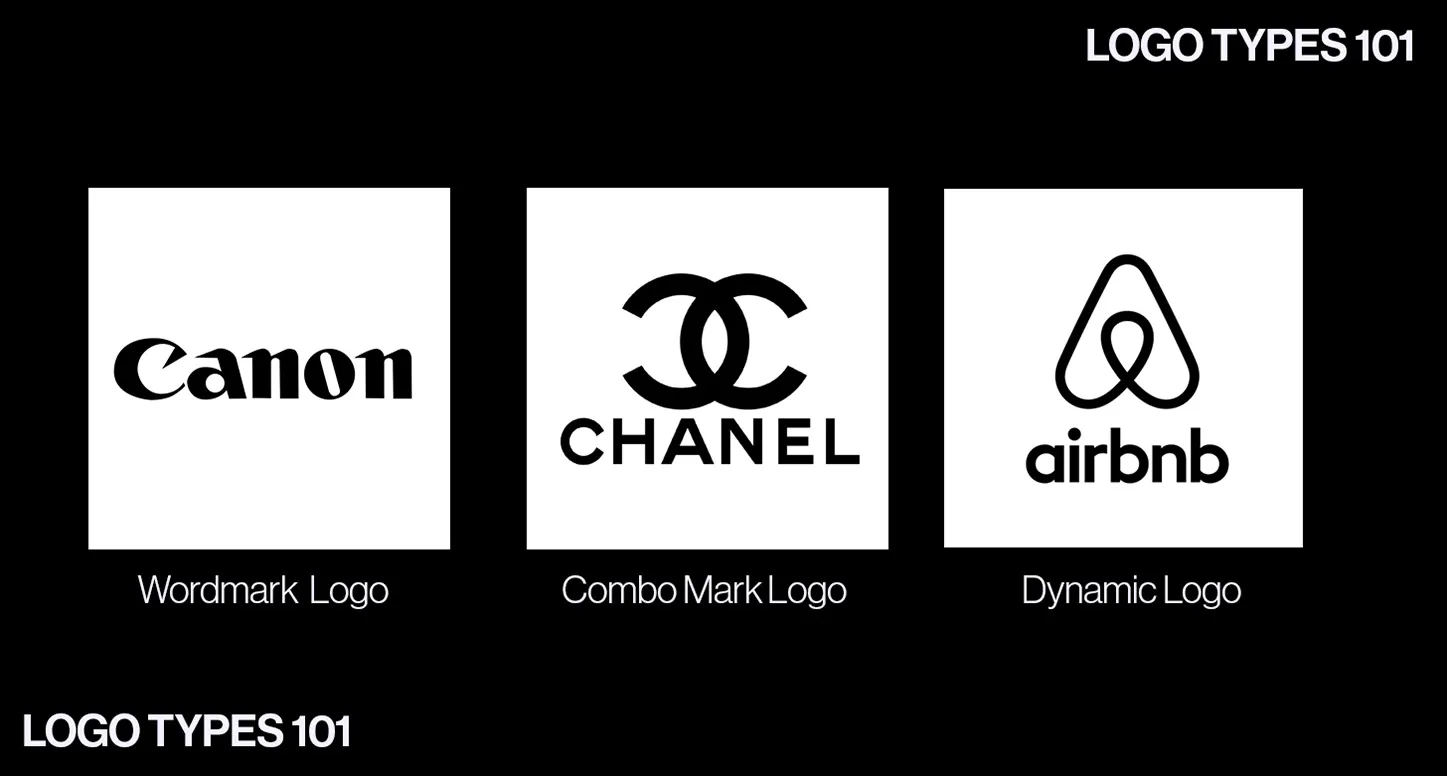
Wordmark
Wordmark, also known as logotype, is a font design that spells out a business’s name. The most famous example of a wordmark logo is Coca-Cola. FedEx is also technically a wordmark logo, but it has a hidden arrow in its text between e and x, which is an example of negative spacing. Other prime examples of a wordmark are eBay, Sony, Tiffany & Co., Disney, and Aquarium Encounters (with elements of negative spacing).
Combination Mark
A combination mark is a design that utilizes two or more logo styles; they are popular for brands because of their versatility. Examples include Taco Bell (wordmark and pictorial), NBC (lettermark and abstract), and APenergy (wordmark and abstract).
Dynamic Logo
Dynamic logos are combination marks on steroids. Usually, they incorporate abstract elements into the design. The core design of a dynamic logo is very consistent, but its color palette will vary. An example is Google’s browser. Its wordmark logo always remains the same, but its theme and colors change depending on holidays and celebrations.

The Psychology of Followers and How They Impact Marketing
Photo Credit: Mover Magazine
THE TOP REASONS BRANDS CRAVE A LARGE AUDIENCE ONLINE AND HOW IT SHAPES SOCIAL MEDIA MARKETING STRATEGIES
The simple Google search, “Do social media followers matter?” results in marketing experts claiming whether they do or don’t. Most explanations boast the best strategies or metrics and how to boost followings organically. Yet, few dare to question if a large social media following is the ultimate authority over success for brands. More importantly, no one asks, why or why not?”
The technology entrepreneur and author of “The Social Media Bible,” Lon Sakfo, posed:
“Can a salesperson’s success be measured by sales? Sure. Can an attorney’s productivity be measured by billable hours? Certainly. Can a professor’s contribution be measured by the number of books published? Maybe. But can someone’s impact be measured by social media followers? No. Nope. Never.”
The negative reputation of social media runs rampant in the marketing sphere, but its influence isn’t so black and white. Even if a large following is just a guise of coveted clout, its power is unmistakably prevalent. Beneath the surface level, past the scheming strategies, and beyond the bold follower counts, is where the real answers lie.
The Psychology of Social Media
Scrolling on social media seems harmless, especially when a comedic TikTok brings tears to one’s eyes or a new follower leaves a nice comment. Even after putting the phone down, something within always begs for more. Psychology proves that no one, follower or influencer, leaves a round with social media unscathed.
Scrolling for Validation
Photo Credit: Morgan Getty Makeup
People are motivated to perceive themselves as valuable and ethical, and the psychological notion of self-affirmation theory proves it. In this theory, people judge themselves in six categories: roles, values, group identities, central beliefs, goals, and relationships. Gregory Serapio-García, a Ph.D. student at the University of Cambridge, believes that social media is an avenue that pleases all those categories.
“When you’re interacting so much with social media, it feeds you a lot of information that shapes your perception of the self and your identity,” Serapio-Garcia said.
In addition to the human mind’s internal egoic and self-affirming nature, it constantly seeks external validation. The need to be respected, recognized, and admired by others is intrinsic in humans, creating the perfect storm for social media and the human ego.
“Social media reactions feel like a hyped-up, magnified version of the validation you would experience in person,” he said.
The Concept of Social Proof
More followers equal more validation and credibility in the human mind. People are subject to the false notion that anyone with a large following on social media must also be worthy. Dr. Leilani Carver, the director of Graduate Strategic Communication and Leadership at Maryville University, explains that the culprit is a persuasive strategy called social proof.
“Social proof is the idea that if someone is unsure about what they should do, they will look to others to see what they do. Then, if many people complete an action or believe something, they will likely do the same,” Carver said.
Psychology helps explain people’s interactions with social media, but it doesn’t validate the credibility of those with large followings. The divergence between social media users like Neil deGrasse Tyson and Kylie Jenner proves that follower count and expertise are not linear. Instagram influencers, psychologists, scientists, and celebrities generate millions of followers, but not all are sound sources. The human mind may perceive people with a large social media following as an authority, but that doesn’t always mean they are.
The Perception of Success
The human mind is responsible for addiction to social media followers and interactions, but perception determines whether they matter on paper. Older generations respect in-person interactions and tend to ignore social media proof, while younger generations rely solely on social media for information about a brand. Even marketers have dualistic opinions on whether or not social media followers matter. None of them are right or wrong. These duplicitous perceptions forge a grey area where an honest answer materializes.
Why Social Media Followers Matter
Photo Credit: Lane 201
Regardless of its reputation, follower count attracts attention and generates value with the public — therefore, it is essential.
Lon Safko, author and technology entrepreneur, said, “Today, the first thing an individual checks before doing business with you is your social footprint.”
Consumers increasingly look to social media to decide if brands hold weight or can be trusted. Whether an account is credible, that bold follower count number pleads for attention and confirms the social proof people seek.
The benefits of a large following materialize in various marketing tactics. Organic follower growth can positively influence all social media metrics, such as engagement, conversion, or virality rates.
Valuable followers can also help to reduce advertising costs — interested followers are more likely to share and interact with posts. A high follower count combined with a high engagement rate proves validity and success across social media platforms. With an organic and engaged audience, businesses can use their large following to build longevity and brand loyalty.
Why Social Media Followers Don’t Matter
High numbers of followers are not always authentic, rendering follower count unable to stand alone as a social media metric.
“There are ways to cheat the system and inflate your numbers — e.g., buying followers — so follower engagement is actually a much better read of influence regarding marketing strategy,” said Carver.
Buying followers is taboo and against most social media platforms’ guidelines, but the atmosphere of validation followers supply is irresistible to some. Regardless, they can skew analytics and key metrics that help businesses measure growth and achievement. Paid followers usually only engage by liking posts; when they comment, it’s seldom authentic. No matter how high a follower count is, it will fall flat without a high engagement rate and follower-to-following ratio.
Many associate a high follower count with a high conversion rate, but this is not always true. High follower growth rates are not always linear to engagement and sales. Plus, brands can still be victorious without social media support.
How to Be a Leader in a World of Followers
Social media followers matter, but they are not the most critical metric. The power of social media followers is in the hands of those who grow them organically. Learning how to optimize a large social media following generates real authority and influence.
Research the Competition

Competition is always a source of inspiration, especially on social media. The way brands maneuver social media signals to other brands in the same category what works best. Analyzing how similar accounts strategize content and interact with their followers pays off.
Graphic designers do well sharing their creations as static posts that users can share with their friends or on their Instagram stories and repost. The cooking community generates followers by sharing short-form video content that gets shown to a broader audience.
Define the Target Audience
Brands that spend time exploring their target audience are the best at growing and retaining them. Demographics like age, gender, and occupation help brands understand where they spend the most time online. Users’ interests tell brands what products or services they may be looking for. The more brands know about their audience, the easier it is to formulate content encouraging them to click the follow button.
Produce Diverse On-Brand Content
Social Media platforms like Instagram, Facebook, and TikTok offer a diverse range of content to users. Algorithms push short-form video content out to broader audiences, making it the best way to grow followers. Carousel posts engage and satisfy current followers. Stories allow users to share all forms of content with their followers, making it an ideal avenue for more exposure to target communities. Taking advantage of all the different content formats will place brands in front of various audiences, including current followers.
Content production must balance between the needs of followers and the rules of brand identity. Brands must decide where trends fit into the balance. If they do fit, they must obey style guides. Followers want to see content that reflects their taste. When they’re not satisfied, followers are more likely to unfollow. Social media content has the potential to produce engagement and increase reach when brands mindfully tailor it.
Reward the Engagers
Gaining new followers isn’t enough to keep the momentum needed to go viral. Brands must nurture their followers to prevent them from hitting the unfollow button a week later. People who consistently interact with posts are the most likely to share those posts with other like-minded people in their communities. Engaging with followers through genuine comment replies, direct messages, and giveaways will enhance the value of their social media relationship with a brand.
Build a Customized Social Media Marketing Strategy

Knowing the audience and the competition enables businesses to curate a social media marketing strategy that best aligns with their brand and goals. Brands can formulate posting schedules that fit into their followers’ scrolling patterns, boosting the performance of their posts. Results and metrics like follower growth and engagement rates help optimize every aspect of the social media marketing plan. The supreme trick is to explore all social media metrics and how they work together, not the singular metric of followers.

How to Use Font Psychology to Influence Perception and Emotion in Marketing
EVERYTHING TO KNOW ABOUT THE PSYCHOLOGY OF FONTS, INCLUDING THE DEFINITION, A BREAKDOWN OF TYPEFACES, AND TOP TIPS FOR LEVERAGING TEXT ACROSS PLATFORMS
Every element of graphic design is purposeful, especially fonts and typefaces. With font psychology, marketers and graphic designers can attach precise feelings to their brands without speaking.
Maya Angelou, American memoirist and poet, said it best, “I’ve learned that people will forget what you said, people will forget what you did, but people will never forget how you made them feel.”
Fonts tell the brand story in a way that elicits emotion, boosting brand recognition and ultimately resulting in conversions. Understanding how different fonts generate feelings through the human subconscious will help brands shape their target audience’s perception of them. Font psychology ensures brands make the most informed and effective decisions around typography, font psychology, and copy.
What is Font Psychology?
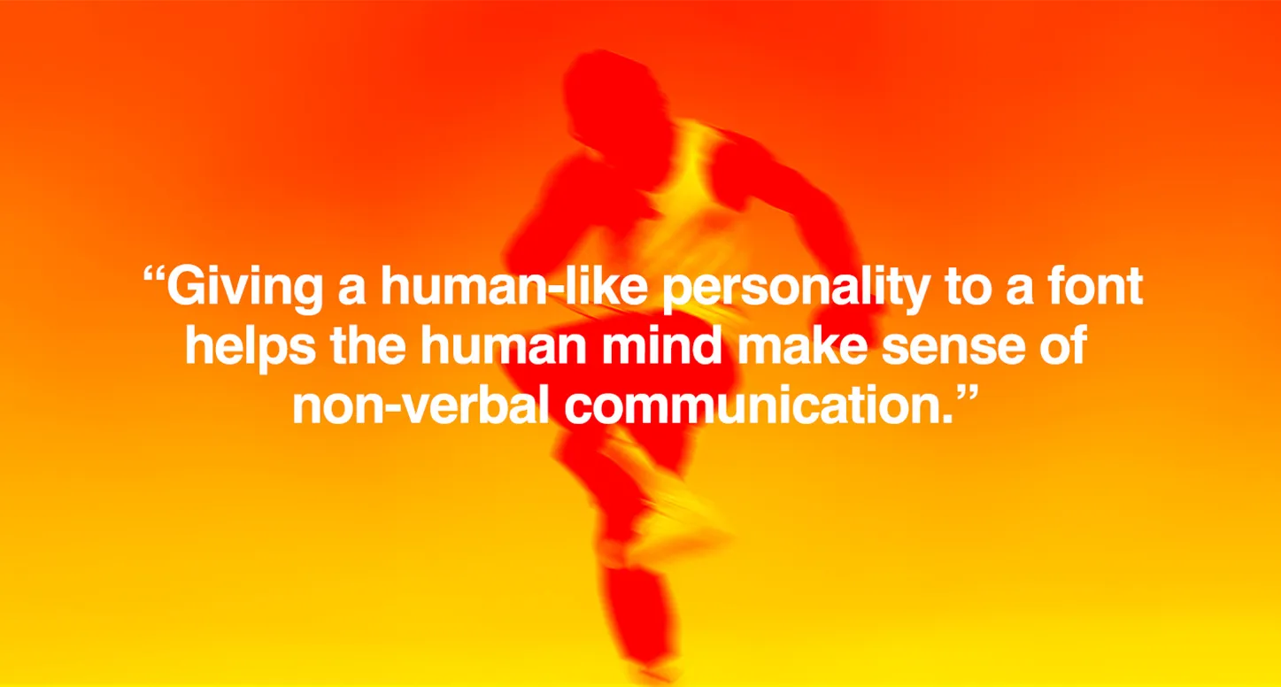
Photo credit: @shotbynw
Font psychology analyzes how people perceive different typefaces or fonts and how it impacts their thoughts, emotions, and behaviors. It’s human nature to anthropomorphize non-living things, especially text. Giving a human-like personality to a font helps the human mind make sense of non-verbal communication. Therefore, different fonts have the power to create diverse emotional responses in audiences.
Any invitation, advertisement, or article with comic sans text evokes playfulness, comedy, and carelessness. Yet, when using Times New Roman, the text reads serious and sophisticated. When choosing fonts, brands adopt all the subconscious emotions, personalities, and perceptions attached.
Font psychology uses specific fonts and human nature to elicit desired emotional responses. The study of typography is a different practice involving crafting other elements of text like color, shape, layout, texture, and space to produce visually pleasing type designs. Still, aspects of typography heavily impact the psychology of fonts. Marketers must consider how typography and font psychology can work harmoniously to generate the brand image and voice they desire.
Font Styles and How People Perceive Them
Fonts break down into five styles, each rendering different emotions, perceptions, and voices. From comical to elite, font styles help brands express their personalities through text. Between serif, sans-serif, slab serif, script, and decorative or display, marketers and graphic designers have various options to choose from to communicate the desired voice of their brands.
Serif
Throughout history, people printed books, newspapers, and advertisements in serif typefaces like Times New Roman, Garamond, and Baskerville. The small decorative strokes, also called serifs, taper off the tops and bottoms of the characters to add more personality to otherwise simple text. Years of usage among publications and academic institutions give serif typefaces the classic and traditional personality people associate with prestigious brands like Wells Fargo, Harvard, Dior, and Rolex. Financial companies, law firms, insurance companies, and consultants favor serif typefaces because they communicate tradition, respect, sophistication, trust, and authority.
Sans-Serif
Modernity and clarity are the two main traits people associate with sans-serif typefaces. Google, Apple, Netflix, Spotify, and Microsoft are just a few brands that have amplified using san-serif typefaces in branding. As the namesake states, san-serif typefaces lack serifs, making them easier to read and condense. Tech companies, fashion brands, and start-ups favor sans-serif typefaces because they represent cleanliness, efficiency, straightforwardness, and innovation. Popular sans-serif fonts include Arial, Helvetica, Futura, and Calibri.
Slab Serif

Slab serif typefaces command more attention than serif typefaces. With more robust and chunky serifs, slab serif typefaces replace traditional with daring. Brands like Marlboro, Volvo, Sony, and Arby’s utilize bold slab serif typefaces to their advantage.
Slab serif typefaces work best with sporty or outdoorsy brands. Automotive companies and manufacturing industries also lean on slab serif typefaces to show they are contemporary, solid, reliable, and vigorous.
Script
Script is traditionally a handwritten, calligraphy-style typeface. Today, there is a duality to the popular yet friendly typeface. Some are elegant and refined, like the typefaces associated with Caddilac and Cartier, while Coca-Cola and Pinterest have more personable script typefaces. The hand-written style of script typefaces like Pacifico and Caveat Brush adds a touch of whimsy and personalization. More elegant typefaces like Edwardian or Vladimir Script represent elegance and exclusivity.
Typography advises against using script typefaces for body text because of the intricate lines, but they make a unique statement for a brand logo. High-end fashion and food and beverage brands rely on script typefaces to show elegance, individuality, expression, refinement, and luxury.
Decorative or Display
Graphic designers often create decorative or display typefaces for branding and advertising purposes. Decorative fonts blend multiple typefaces to curate a memorable, customizable look. Brands like Lego or Disney have a unique brand identity and a logo style to match. Children’s brands, marketing and advertising agencies, and musicians typically choose decorative fonts to portray creativity, originality, playfulness, and enjoyment.
How To Optimize Font Psychology
Like typography, font psychology works better when all text is consistent, pleasing, and easy to interact with. Font psychology is a powerful tool, but it’s most potent when thoughtfully integrated into marketing and branding strategies.
Foster Web Browser Compatibility
No matter what typeface brands choose for their logo or websites, if the text is illegible or not web-safe, it will be offputting and disturb the customer experience. Testing how fonts translate on different platforms will prevent any blunders in places where text appears. Brands that opt for system or web-safe fonts can avoid the chance of disarray altogether.
Research and Test to Find What Works Best

Conducting thorough research and A/B testing can fine-tune font choices to align with marketing goals and resonate with target audiences. Brands will find that, through research, they can quickly identify which fonts and typefaces connect most to the target audience.
Prioritize Consistency
Once brands pick a typeface, they must use it on all print collateral and online platforms to maintain uniformity and boost brand recognition. Attention to details like kerning, leading, and tracking ensures readability and visual harmony. Consistency in font size and spacing across various marketing materials will reinforce the brand’s identity and message.

What is Product Photography?
A PRACTICAL GUIDE ON PRODUCT PHOTOGRAPHY, HOW IT WORKS, AND WHY IT MATTERS
Before product photography became mainstream, businesspeople had to rely on wit and the theatre of flowery vocabulary to market their products to buyers out of sight. It was a game of words. Non-readers were quietly excluded from the customer pool, and sellers who were dishonest (and crafty enough) sold the punchline as the product.
Case in point: in the early 1990s, Steve Comisar famously sold a “solar-powered clothes dryer” for $49.95, only to have buyers receive a length of clothesline.
Product photography swung the balance in favor of buyers and honest sellers. Buyers became more confident about purchasing from a distance, and sellers even more intentional in how they presented products.
Today, product photography is the reason that mail order shopping exists and thrives, and, by extension, the entire logic of modern e-commerce.
This guide explores the what, why, and how of product photography. Why it matters across industries, what separates compelling imagery from “just photos,” and how to build a product photography setup that works. It also weighs the big question: whether professional product photography services are worth their salt, or brands are better off winging product shoots in-house.
What is Product Photography?
Product photography is simply the process of capturing product images for the purpose of branding, advertising, and/or sales. In many cases, it serves as an inadvertent stand-in for the physical product, allowing potential customers to experience it without touching it.
Unlike casual or artistic photography, product photography is purpose-driven. Every choice, from lighting and angles to background and styling, is designed to incite customer interest. Think of it as doing the job of a salesperson, answering the questions about what a product looks like, its features, and functionalities.
Types of Product Photography by Purpose

Product photos are not all created for the same reason. No doubt, every product image should ultimately support sales, but brands generally commission these images with different objectives in mind, depending on how they would be used and what they hope it might accomplish.
Some product images would be considered inadequate if they fail to answer customers’ questions, especially regarding the product description. Other images are produced to shape perception, spark customers’ interest, and/or communicate the brand’s value, prompting the customer to make a buying decision.
Generally, most brands will lean on one purpose or another, depending on:
- Where the image will appear or how it will be used, e.g., product pages, marketplaces, campaigns, etc.
- Whether or not the audience is familiar with the product
- Whether its goal is to support a purchasing decision or to influence preference or emotion
Commercial Product Photography
Commercial product photography is designed to position the product for attention and persuade customers of its desirability. Its primary goal is to influence how a product is perceived—whether emotionally, aesthetically, or symbolically.
This type of product photography is typically used in advertising and promotion. However, commercial product images may also be adapted for lookbooks, website heroes, and other brand-forward marketing material. In these setups, the products are rarely photographed in isolation. Instead, the product may be framed within a concept or narrative that communicates its value beyond just features.
Commercial product shoots are done in formats like lifestyle photography, contextual imagery, creative flat lays, and conceptual or editorial-style shots.
E-Commerce Product Photography
Unlike commercial product photos, which may (sometimes) get away with remaining somewhat obscure, e-commerce images must show the product in detail. These are generally created to support a customer’s purchase decision and present the product clearly so that it can be evaluated without physical contact.
In e-commerce product photography, the goal is to answer questions like how large the product is, how it was constructed, and what its key details look like up close. The images produced are usually used on product pages, online marketplaces, digital catalogs, and inventory systems—essentially, places where customers need clear information about a product’s features and/or functions.
The formats used here include white-background images, scale shots, detail close-ups, group shots showing variations or sets, 360-degree views, and packaging photos.
Format-Based Types of Product Photography

Once the purpose of the product shoot is clear, the next consideration is the format of the product images. Format-based product photography types generally relate to how an image is executed rather than what it is intended to achieve. These formats are often referred to when discussing deliverables with photography studios because they ultimately define the look, structure, and technical approach of the final images.
Unlike purpose-based categories, format-based types are presumptively flexible. One format can support different goals depending on styling, placement, and context. For example, a lifestyle image may work well for a campaign visual and on a product page to help customers understand the product’s function and/or size.
White Background Product Photos
White background shots are the O.G. of the e-commerce photo stratosphere. They are classic, no-frills product images used on virtually every marketplace or e-commerce site. These images are usually shot against a white or plain backdrop, which helps draw full attention to the product and minimize distractions. They are especially effective for product listings, catalogues, and comparison platforms. Typical white background product photos are taken in a studio with even lighting. They show the item clearly from one or multiple angles.
360-Degree Product Photography
This technique involves capturing a product from every angle, allowing customers to virtually “spin” and view it as if they were holding it in their hands. Photographers typically use a rotating turntable to photograph the item from multiple angles, then stitch the images together with specialized software. While more resource-intensive, 360-degree images create an immersive shopping experience and can increase conversion rates by 10–30%.
Lifestyle Product Photography
Lifestyle shots feature real people using the product in a simulated real-world setting. The idea is to tell a story with the product in context, helping shoppers imagine themselves using it. These images are great for ads, social media, and banners, and can also support product pages by demonstrating product usage.
Contextual Product Photography
Similar to lifestyle photography, but without people. Contextual shots show the product in a natural or everyday setting, highlighting its environment or usage context. For example, furniture may be shown around a kitchen island, or a yoga mat may be rolled out in a serene studio. These images are particularly useful for home goods, décor, and products where setting provides scale or style cues.
Scale Shots
Scale shots include a reference object or background to show the product’s size. This provides context for customers who might otherwise struggle to judge dimensions from a standalone image. Examples include showing a product in someone’s hand or next to a common object.
Detail Shots (Close-Ups)
Detail shots zoom in on a product’s features, textures, or craftsmanship. These highlight materials and small design elements that a standard full-product image might not show clearly. Examples include stitching on a leather handbag, engraved watch bezels, or fabric textures.
Group Shots
Group shots feature multiple items in the same image, such as variations of a product, sets or bundles, or a collection from the same line. They are useful for emphasizing variety, quantity, or how items complement each other.
Flat Lay Photos
Flat lays are taken from a bird’s-eye view of items arranged on a flat surface. They are effective for storytelling, showing product relationships, or conveying a theme. Flat-lay photos often double as social media content due to their stylish presentation.
Packaging Photos
These images showcase the product’s packaging, such as boxes, bottles, jars, or labels. Packaging photos are important for online shoppers to know what to expect and highlight any packaging that adds to the product’s appeal.
User-Generated Images (UGC)
UGC includes photos taken by real customers, such as Instagram posts, unboxing images, or other user photos. These provide authenticity and social proof, humanizing the brand. However, UGC is supplemental and cannot replace primary professional images due to inconsistencies in quality and execution.
How Is Product Photography Done?

Product photography requires a little more intention and planning than simply pointing a camera at an item and clicking away. Notwithstanding, the fundamentals of the process remain the same whether the products are shot in-house or by a product photography service:
Step 1: Establish Intended Use
As mentioned earlier, the process for photographing a product will likely vary with the purpose of the image. Before setting anything up, clarify the purpose of the images and where they will be used. This will dictate the required photography, background selection, image orientation and format, and the number and style of photos required.
It may help to create a shot list detailing specifics of the required image(s), including alternate angles, close-ups, scale references, and contextual or lifestyle shots. For larger catalogues, grouping products into “families”—by size, colorway, or product line—can help maintain consistency across all SKUs and deliverables.
Step 2: Prepare the Product
Photography lighting is designed to highlight minute details, so even minor imperfections are likely to become visible during a shoot. Basic prep makes a significant difference, such as cleaning surfaces, removing debris, polishing reflective areas, smoothing packaging, and correcting crooked labels or accessories. For products with multiple variants, stage and verify each SKU in advance to avoid omissions during the shoot.
Step 3: Set Up
Product photos are all about the setup. Lighting is the most important technical element of any production; a controlled studio or DIY setup helps produce consistent results across multiple shots. The background is also crucial—whether white or styled, it should highlight the product and support the image’s goal without competing with it.
Step 4: Choose the Best Angles and Capture Multiple Variations
Product shoots are a game of angles. The goal is to present the product in its best light while providing useful information about its use and function. Common angles include:
- Front or three-quarter views to highlight the product’s shape
- Side or back views
- Top-down views for flat products or flat-lay format
- Close-ups for materials, textures, or key features
Step 5: Edit, Review, and Master
Post-production allows photographers to clean up images, correct exposure and color balance, and refine backgrounds or cutouts. Consistency is key: colors should match across SKUs, and the collection should feel harmonized. After editing, images are reviewed to ensure alignment with the brief before being exported at the appropriate sizes and formats.
Product Photography Setup
Most brands will need a DIY setup when starting out. While it may not rival professional studios, it provides a practical way to capture images for social content, product updates, and early-stage listings. A basic setup typically includes:
- A smartphone or entry-level camera
- Lighting kit (natural light may also work to a limited degree)
- A neutral background such as white paper, fabric, or foam board
- Reflectors to control shadows
- Simple editing software
What Does A Product Photography Service Do?

Product photography services are specialized commercial offerings that develop high-quality, professionally styled product images for businesses. They generally leverage technical expertise in composition, lighting, and camera equipment beyond what is typically achievable with standard consumer gear.
Most product photography services begin with pre-production. Here, the photographer collaborates with the client to define the creative direction, identify target aesthetics, and develop a detailed shot list.
During production, the service manages all aspects of the shoot, including setup and the selection and arrangement of props.
After the shoot, post-production includes meticulous digital retouching, color correction to match the actual product, background manipulation, and optimization of file sizes and formats for various online and print applications.
Frequently Asked Questions About Product Photography
What is Product Photography Used For?
Product photography is a production process that develops images to visually present products for e-commerce listings, advertising, catalogs, packaging, and marketing material. They aid customers in understanding and evaluating items without physical contact.
Why Is Product Photography Important For E-Commerce?
Product photography is important for e-commerce because customers rely on images to assess the product quality, size, and details. In some cases, they also help to demonstrate use.
How Many Product Photos Should A Product Have?
This varies by product type and the channels where the brand intends to publish them. Most e-commerce products need a main image, alternate angles, close-up detail shots, scale shots, and sometimes lifestyle or contextual images.
What Background Is Best For Product Photography?
Backgrounds depend on the image’s purpose. White backgrounds are commonly used for e-commerce because they reduce distractions and meet marketplace requirements. Lifestyle or contextual backgrounds are often used for marketing and advertising.
Can Product Photos Be Edited?
Yes. Editing is standard in product photography. It is used to correct lighting, color, and minor imperfections while maintaining an accurate representation of the product.
What Is The Difference Between Product Photography And Commercial Photography?
Product photography focuses specifically on products, while commercial photography is broader and includes advertising, lifestyle, and brand storytelling imagery. Commercial product photography combines both.
Does Professional Product Photography Increase Sales?
High-quality product photography can improve trust, reduce hesitation, and support conversions by helping customers clearly understand what they are purchasing.
Ready to Get Started?

When product photography starts doing real work—supporting ads, driving conversions, reducing returns, and carrying brand perception—“good enough” images become expensive. Not because they look bad, but because they undercut momentum.
A professional product photographer does more than take great photos. They build systems that make products look consistent across an entire catalog, translate materials accurately, and deliver images that are actually usable across platforms without the usual patchwork of mismatched crops, lighting, and color.
This is what tends to change when a brand switches from DIY to professional photography:
- Product pages look cohesive, not cobbled together.
- What appears online aligns with what arrives in a box.
- Images become conversion assets.
- Production becomes scalable: launches, new SKUs, seasonal updates, and campaigns no longer feel chaotic.
For brands that want imagery that sells clearly, looks premium without trying too hard, and holds up everywhere it appears, working with a professional team is not a luxury. It is often the most direct way to tighten brand perception and improve performance.
Need product photos that look consistent, conversion-ready, and genuinely on-brand?
POLA helps brands plan, shoot, and deliver product images built for both commercial campaigns and e-commerce listings. We make visuals that deliver: make the product easy to trust and hard to ignore.

Storytelling Through Videography: Techniques and Tips
Crafting Stories with Video
Videography is an art form that allows brands to tell their stories visually. This article provides techniques for effective storytelling through video.
Engaging Your Audience
Use techniques that engage your audience and keep them invested in your story.

Exploring Different Photography Styles for Brands
Choosing the Right Photography Style
Different photography styles can evoke various emotions and responses. Understanding these styles can help brands choose the right approach for their campaigns.
Documentary vs. Commercial
Documentary photography captures real-life moments, while commercial photography focuses on promoting products. Knowing the difference can guide your creative direction.